2 min read
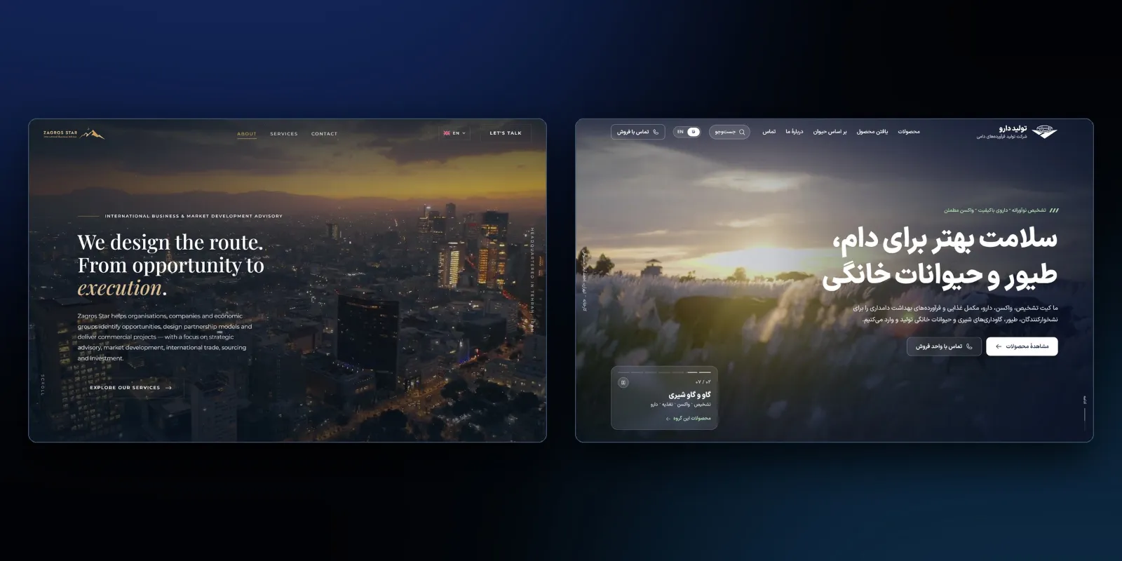
Case study: Tolid Daru’s bilingual veterinary product website
Dedicated product pages in two languages, search that accommodates typos and disease codes, and a catalogue designed for clear browsing.
Tolid Daru makes, imports and distributes veterinary products: vaccines, diagnostic kits, supplements and medicines for cattle, sheep and goats, poultry, dogs and cats. Their buyers are vets, farms and distributors, and the question they arrive with is almost always the same: do you have this product? We designed and built the website around that question.
What the site had to do
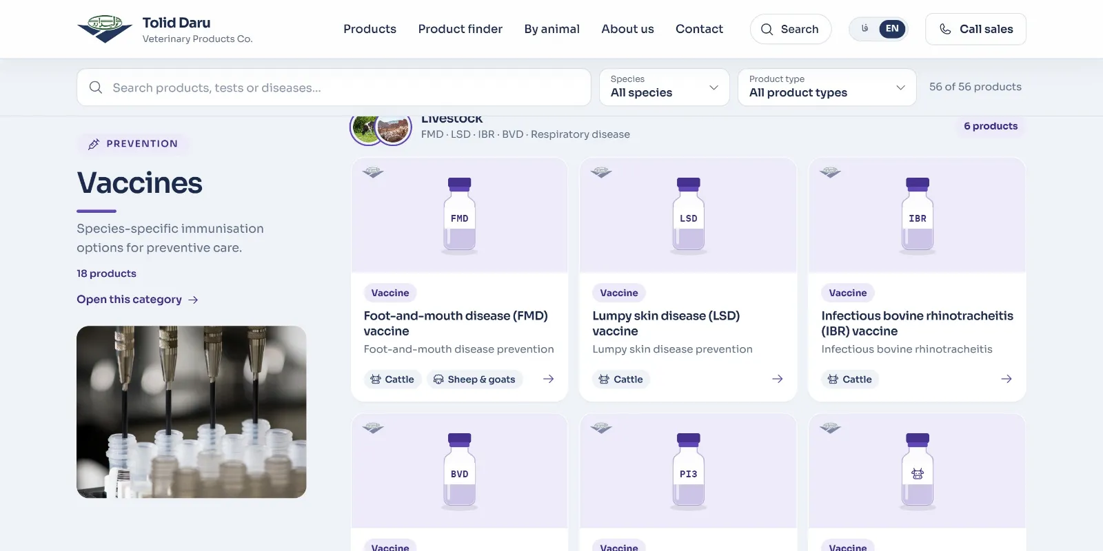
- Present 56 products in three categories, clearly enough that a buyer can tell a vaccine from a diagnostic kit at a glance.
- Answer "do you carry it?" quickly, in Persian or English, however the product is typed.
- Work in Persian first, with a full English version, for local buyers and international partners.
- Be found: when someone searches for a product, a disease or an animal, the right page should come up.
A page for every product, in both languages
Every product has its own page in Persian and in English, 112 product pages in all, plus pages for each category and each animal ("vaccines", "poultry", "cats"…), so that a search like "poultry vaccines" lands on a page written for exactly that. Each page has its own title and description, a canonical address, links to its other-language version, and structured data describing the company.
Pages are generated in advance and served as static files, reducing the need to generate a page for each request.
A search that answers the real question
The search box in every page header does not just filter a list. It answers: a green "yes, we carry it" with the matching products, or a clear "this isn't in our product list" with the sales email and phone number, so the visitor knows what to do next either way.
It is forgiving in the ways real typing needs:
- Persian or English, and Persian typed on an Arabic keyboard layout.
- Persian digits as well as Western ones.
- Disease codes and other names for the same disease or animal.
- Typos, with a "did you mean" suggestion when nothing matches.
A catalogue you can read at a glance
Each category has its own colour, and each product card shows a drawing of its package by product type (a vial, a rapid-test cassette, a feed sack, a bottle) instead of a stock photo. A buyer scanning the catalogue sees what kind of product something is before reading its name. On phones each product family becomes a row that scrolls sideways.
Ordering without friction
Every product page has an order box with the sales email and phone number. "Write an email" opens the visitor's own mail app with the product already named in the subject and a short form in the body, so a request arrives with what the sales team needs. On phones an order bar stays at the bottom of the screen.
Lessons from the project
- Design around the visitor's first question. For a product company it is rarely "who are you?"; it is "do you have it?".
- Search is a conversation. Telling someone clearly that you don't carry something, and how to ask anyway, is as useful as finding what you do.
- One page per thing people search for. Product, category and animal pages each match a different kind of search, in each language.
Contact us to discuss a product website for your business.